




By Shanu Khan, Founder, FocusOn Interiors
For much of corporate history, colour in offices was treated as a risk. Neutral tones were chosen not because they were effective, but because they were unlikely to offend. Grey was safe. White was professional. Beige was invisible. What was rarely questioned was whether these choices actually helped people work better. That question is now being asked with seriousness. As offices are re-evaluated in the age of hybrid work, talent mobility, and rising expectations of employee experience, colour has emerged as one of the most underestimated performance drivers in the built environment. Not as decoration, but as a cognitive and behavioural tool.
Psychologists have long observed that the human brain processes colour faster than text or form. In fact, visual information is absorbed in under 200 milliseconds, and colour accounts for a significant portion of that first impression. In an office, this means employees form subconscious judgments about a space before they sit down, open a laptop, or speak to a colleague. Those judgments influence mood, energy, and even willingness to engage. This is where colour begins to matter economically.
The Psychology Most Offices Ignore
One lesser-known insight from environmental psychology is that the brain does not respond to colour in isolation. It responds to contrast, saturation, and context. A bright colour in a retail store signals urgency and movement. The same colour in a focus-heavy office can increase cognitive fatigue within minutes. Research in workplace psychology shows that high-saturation colours increase alertness but also elevate stress hormones when exposure is prolonged. This is why the most effective offices rarely use bold colours at eye level in work zones. Instead, they rely on softened tones and low-contrast palettes that reduce what psychologists call visual friction. Less friction means the brain spends less energy processing the environment and more energy on the task at hand.
Interestingly, blue is often associated with productivity, but not for the reason people assume. It is not calming in itself. It simply has fewer associations with threat or urgency in the human brain. This makes it easier to ignore. In cognitive terms, the best working colours are not stimulating. They are forgettable.
Colour as an Invisible Wayfinding System
Another under-discussed function of colour is spatial cognition. Humans navigate spaces using colour before they use signs. Studies in environmental design show that people are up to 25 percent faster at navigating buildings that use colour-coded spatial cues rather than textual signage. Modern offices are quietly using this principle. Focus zones, collaboration areas, and social spaces are often differentiated through subtle colour shifts rather than walls or labels. Employees do not consciously register these decisions, but they respond to them. They lower their voices in cooler zones. They linger longer in warmer ones. This is behavioural design at work. It reduces the need for rules and increases intuitive use of space.
From a commercial perspective, this improves space utilisation without increasing square footage, an outcome that directly impacts real estate efficiency.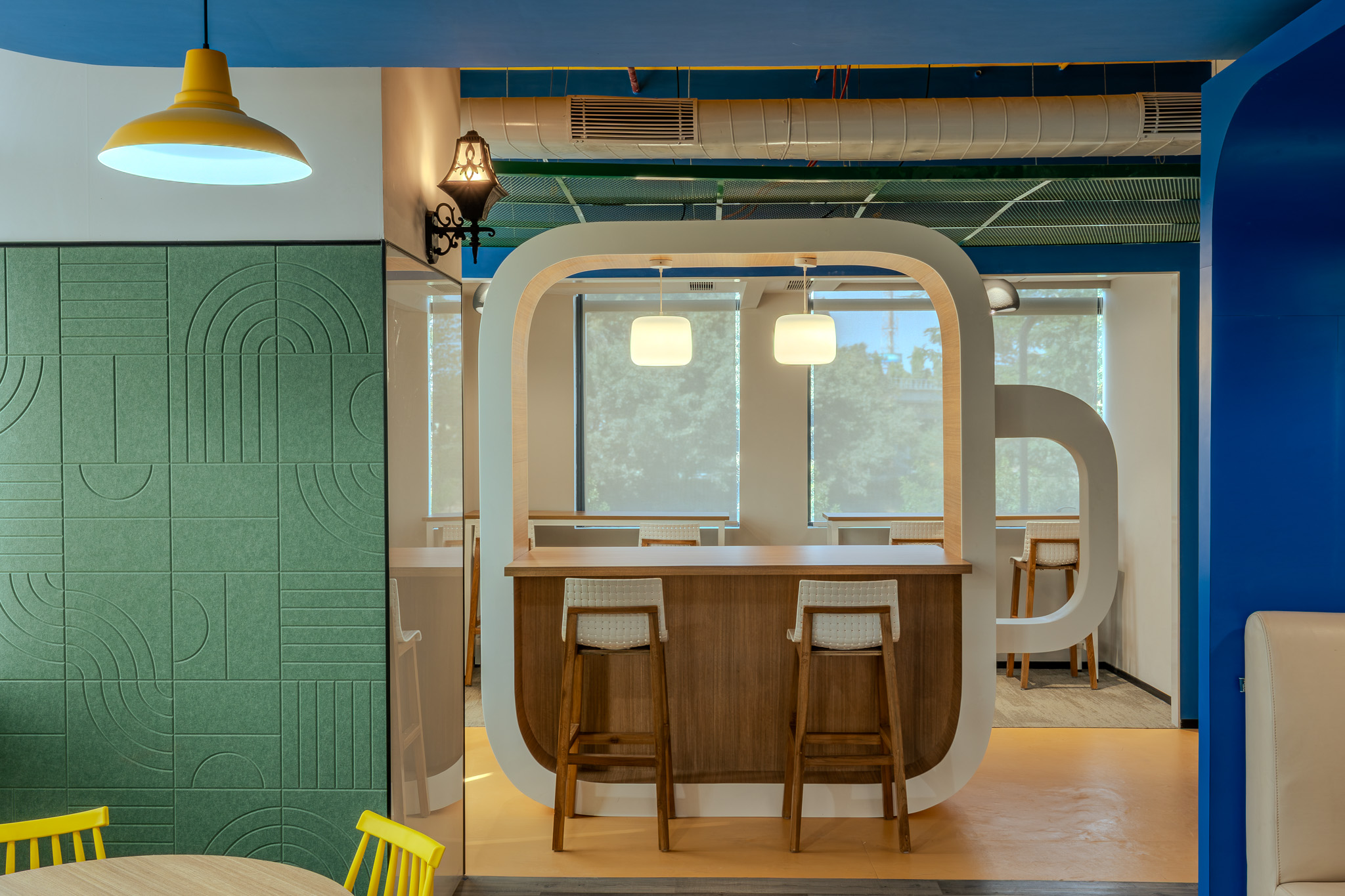
Why Ceilings Have Become a Strategic Surface
One of the more surprising developments in office design is the renewed attention to ceilings. Historically, ceilings were either concealed or ignored. Today, they are actively designed. There is a neurological reason for this. Large open spaces with exposed services create what psychologists refer to as perceptual overload. The eye struggles to find hierarchy, which leads to subtle but constant cognitive strain. Introducing colour or tonal order at ceiling level helps the brain organise the space. Painted services, acoustic baffles, or suspended elements are not aesthetic flourishes. They are tools to reduce mental noise.
In open-plan offices, ceiling colour is increasingly used to define zones without building physical barriers, preserving openness while restoring a sense of scale and comfort. This approach is also financially efficient. It delivers spatial clarity without sacrificing flexibility or increasing construction complexity.
Colour and Visual Identity: More Than Brand Colours
Most organisations misunderstand how colour contributes to visual identity. It is not about repeating brand colours. It is about reinforcing brand behaviour. Financial institutions tend to favour low-contrast, controlled palettes because trust is built through visual stability. Technology companies often introduce higher contrast and warmer accents in collaboration areas to signal speed and experimentation. Healthcare and life sciences lean into biophilic tones because the human brain associates them with recovery and balance.
What is rarely discussed is that colour consistency inside an office has a stronger impact on brand perception than logos or graphics. Employees internalise brand values not through statements, but through repeated environmental cues. Over time, the workspace becomes a form of behavioural branding. When done well, this creates alignment without instruction.
The Wellbeing Effect That Compounds Over Time
Colour also affects how long people can comfortably stay in a space. Visual fatigue is a measurable phenomenon. High contrast, poor light reflection, and aggressive palettes accelerate it. Softer tones and controlled reflectance reduce it. Daylight amplifies this effect. Lighter colour palettes reflect natural light deeper into floor plates, reducing dependence on artificial lighting. Some studies estimate energy savings of up to 15 to 20 percent in well-optimised offices, but the more valuable return is human. People report fewer headaches, better focus, and lower end-of-day exhaustion. These are not dramatic outcomes. They are marginal gains. But marginal gains compound, especially across hundreds of employees and thousands of working hours.
Designing for Change, Not Trends
Despite the renewed interest in colour, the most effective offices remain cautious. Trends fade quickly. Operational buildings last decades. The smartest strategy separates permanence from adaptability. Neutral base palettes form the long-term backbone. Colour enters through elements that can evolve, furniture, soft finishes, graphics, and feature zones. This allows organisations to refresh their environments without structural disruption. It is the same logic applied in manufacturing and systems design. Stabilise the core. Adapt the interface.
A Quiet Shift With Lasting Impact
The future of office colour will not be louder. It will be smarter. Psychology, and workplace strategy continue to intersect, colour decisions will increasingly be made with the same seriousness as layout planning or technology infrastructure. Not because they look good, but because they work. In modern offices, colour is no longer about taste. It is about cognition, behaviour, and performance.
About the Author
Shanu Khan has over 7 years of experience in managing and executing structural and interior projects, with a focus on commercial, corporate, and institutional spaces. He brings a keen understanding of client needs and industry trends to drive innovative design solutions. As Managing Director, he has cultivated a collaborative environment fostering creativity and strategic leadership. He is committed to delivering excellence in interior design, translating vision into reality and making a lasting impact on the built environment.