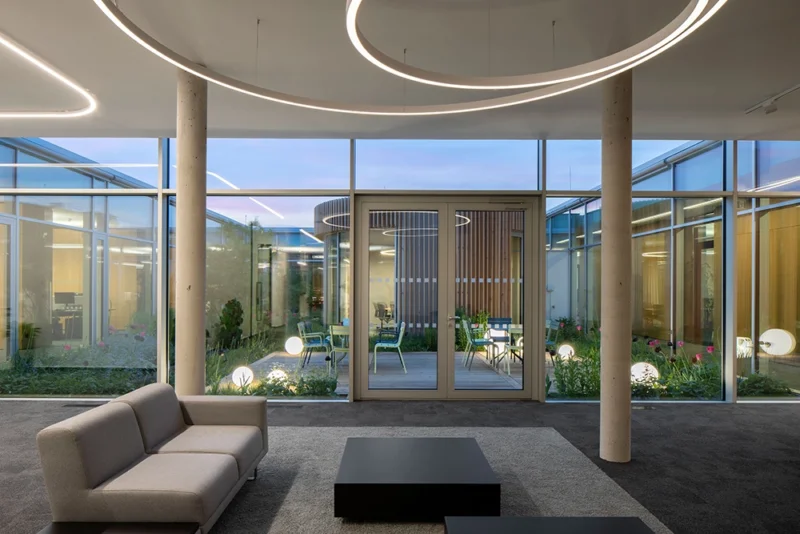
The Baumit Headquarters, designed by Sebastian Nagy Architects, showcases a bold fusion of minimalism and modernity, echoing Baumit’s expertise in innovative construction and materials technology. By cleverly balancing initial impact with lasting impression, the architects have crafted a cutting-edge administrative building in Brandýs nad Labem.The project has been awarded a 2024 International Architecture Award by The Chicago Athenaeum: Museum of Architecture and Design and The European Centre for Architecture Art Design and Urban Studies.
The Baumit administrative building is a typologically significant structure, a representative headquarters.
The message it conveys is that the company understands construction, selects an excellent design, and successfully executes it.
Initially, the building seemed Expo-pavilion-like, somewhat detached, situated in one piece of the regular grid of the industrial zone.
Unlike Expo pavilions, which are often purpose-built for short-term exhibitions, and lack sustainability, Baumit’s headquarters mirrors the joy of success and a positive sense of pride for the company.
In today’s industrial zones, such structures are the factories, pushed outside city limits.
Operations like various construction productions fit well into these “box” locations. It is logical for the headquarters and administration to be in such an industrial zone.
The building’s spaces are not random but intentionally created, simple, and therefore powerful.
A wall separates the existing production zone from the new building, and a pavilion is attached to this wall, open to the expansive entrance landscape. Inside the building hides another landscape, a small-scale atrium with a colorful array of carefully planted foliage.
It made me wonder why mighty supermarkets in the surrounding gray boxes don’t commission similarly fantastic and straightforward public spaces.
The layout is organized using the compositional principle of “shapes within shapes.”
The large rectangle of the building is a framework into which other rectangles of functional spaces are inserted, adorned with a circular meeting room in the atrium. Working with these inserted rectangles allows excellent illumination of the building and provides excellent orientation.
Corridors between the functional spaces’ rectangles remain entirely understandable, intuitively guiding users through the building.
One of the rectangles is empty – it’s the atrium, illuminating the interior layout.
The overall openness and clarity of the interior are emphasized by the glazed portions of walls between offices, creating the impression that the entire structure needs almost no support.
At first glance, the interior harmonizes with the exterior. Where there is concrete and glass outside, there is warm wood for cabinets and carpet inside. The scale decreases to create a comfortable atmosphere within the building. Monolithic columns are thin, 200 mm in diameter, in a grid of 1,200 mm that transforms in several planes.
The ceiling slab is bent in the perimeter console to enhance the impression of lightness with its subtlety, while insulation takes place above the structure. The console, along with semi-transparent external blinds, reduces the building’s thermal load.
Cabinets and kitchens are built-in and lockable, eliminating the need for mismatched furniture. The building is exceptionally airy due to its bright height, resulting from the ceiling design without suspended ceilings and installations under the floor, as well as door heights of 2,600 mm.
Source: globaldesignnews.com
Project: Baumit Headquarters CZ
Architects: Sebastian Nagy Architects s.r.o.
Lead Architect: Sebastian Nagy
Contractor: Syner Group a.s.
Client: Baumit, spol. s r.o.
Photographers: Tomas Manina
Subscribe to Updates
Get the latest creative news from Architecture Update about art, design and business.
Sebastian Nagy Architects Design Baumit Headquarters, focus on construction and materials technology
Related Posts
Add A Comment


